Kia.com Homepage Redesign


BACKGROUND.
Kia had undergone a complete redesign of their website and went responsive (through another agency). Since then, Kia’s ranking in the JD Power Mobile Site Study has dropped from first to almost last. Since we had designed their initial mobile site that took first place, Kia reached out to us to redesign the responsive site to gain back mobile traction.
THE ASK.
Redesign the responsive site with a “mobile-first” approach.
MY ROLE.
I was the Creative Director on this assignment. We were extremely short on staff so I also worked on the UX and UI Designs (storyboards, wireframes, use case scenarios) and the Visual Designs (Layered and Layer Comped PSDs). I was responsible for walking clients through our concepts, our wireframes, and our designs. I also worked with the in-house development team at KMA to ensure that the experience translates from mock to code.

MY PROCESS.
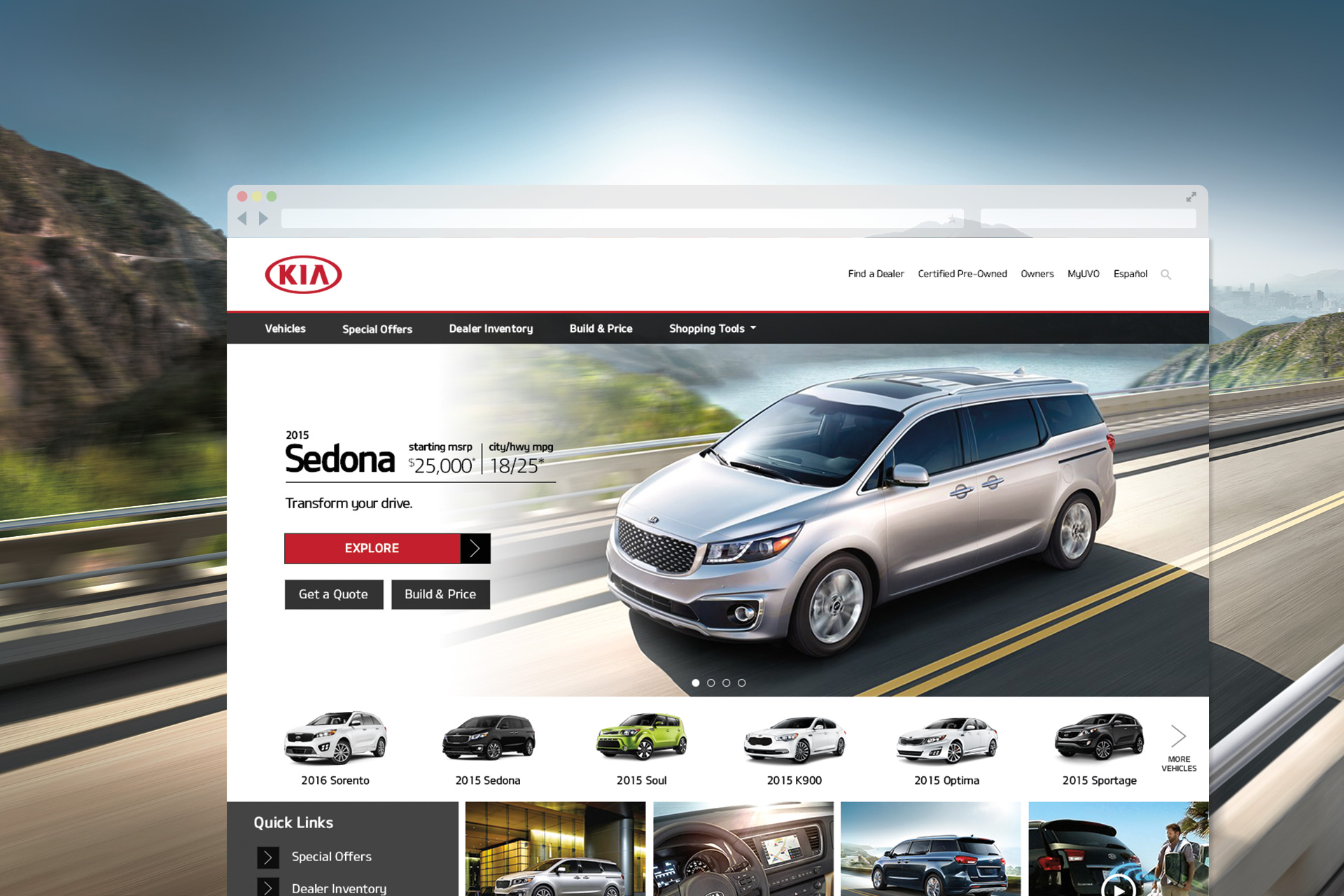
With the responsive design, the Kia 2.0 homepage lost some important pieces of functionality that existed in our 1.0 version: a vehicle carousel to quickly get to a model page and CTAs to links to lead-generating pages. To start, I compared the analytics reports between their 1.0 site and 2.0 site. Paying attention to various design changes and how it affected the results, I mapped out elements that worked well and ones that were less successful.
Mobile-first design helps to keep the entire site simple and lightweight. If it doesn’t fit on the small screen, it doesn’t belong on the big screen either. Huge consideration was also given to the first fold of the smartphone breakpoint. Because Kia’s 2.0 site was NOT mobile-first, things did not scale down well on smaller screens. Much real-estate was given to huge hero images with important content way below the fold. With this theory in mind, I limited the Kia homepage to the most important elements: hero, vehicles, promotions, and main CTAs— making sure that the most prominent items sat comfortably in the first fold across all breakpoints. Leveraging mobile swipe gestures, I was able to give the client 2 sets of promotional areas: the hero and also the promotional thumbnail area. Mobile gestures and UI took center stage aiding us in fitting a lot of meat on a small plate. Swipe gestures are easily translated to big browser with the use of arrows. Users would be able to use the mouse to drag or simply click on the back and forth arrows. Accordions and toggles allowed users to quickly show and hide content. Hero images were carefully designed across different breakpoints and orientations to ensure that they would always fit comfortably within a page without overwhelming the layout.

THE RESULT.
The new site design saw tremendous lift in engagement as well as purchase intent. Online leads have increased dramatically as a result. JD Power ranked this redesign as most improved in consumer satisfaction. Client was happy.